Google Tests New Mobile Search Format: Publication Name and Date Take Prominent Positions

Well, the testing is still ongoing regarding how links appear in Google Search. On May 7th, I reported that Google was testing a new format where the permalink appeared on top with the name of the publication just below it. Now, I have spotted yet another change in the appearance of links on Google Search.
Similar to my previous report, there is no significant change in the desktop version. However, the mobile version now shows a different format for the links.

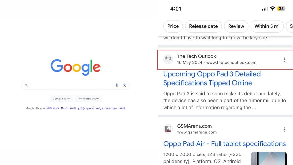
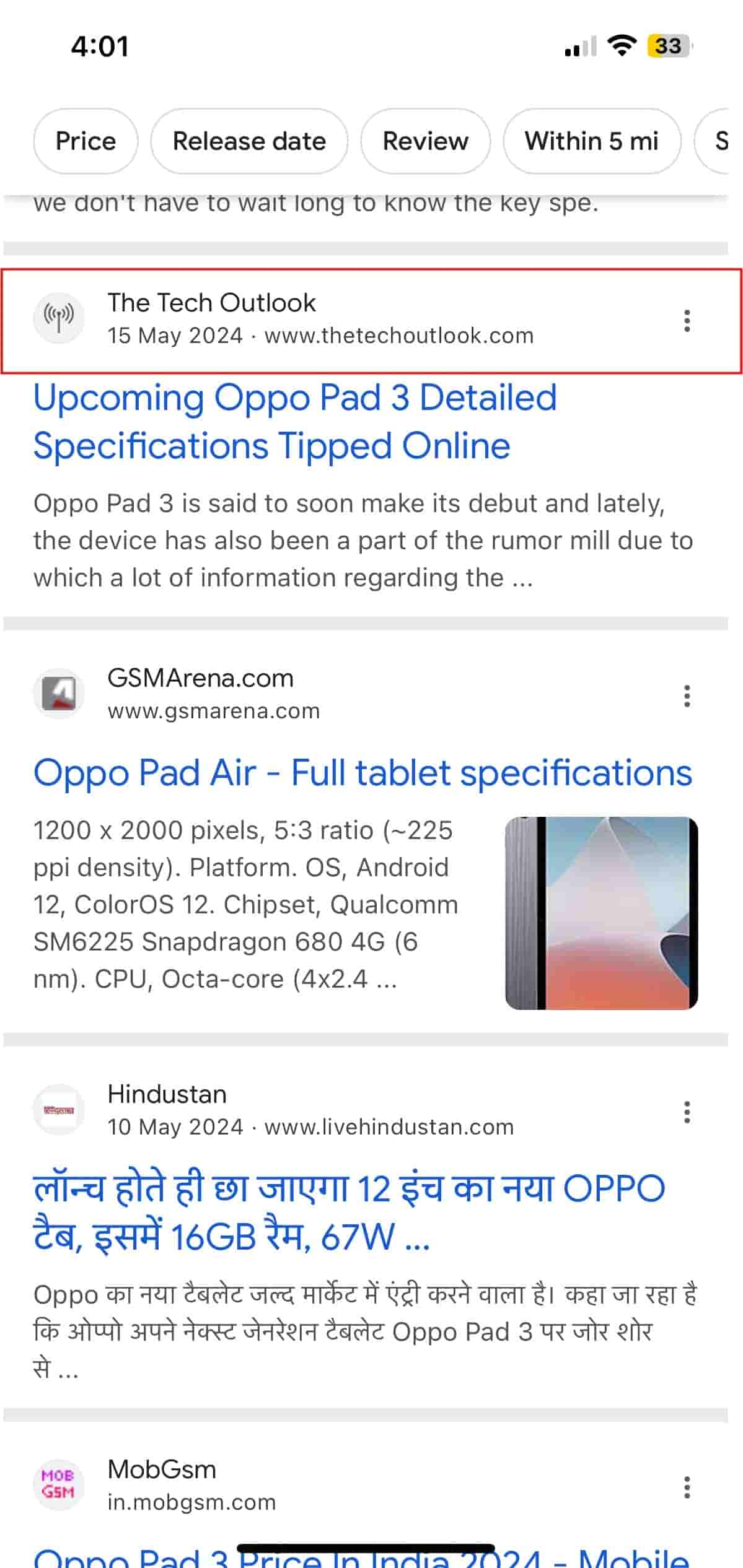
Now, coming to my findings from today: if you notice the screengrab above, there are noticeable changes in the appearance. The name of the publication has been moved to the top, and there is a significant change in how the date is shown. Previously, the date was in front of the meta description. In this new format, the date is moved just below the publication name, and next to it is the domain name instead of the permalink. Below this, you can see the headline and the meta description.
To me, this looks neater in terms of visibility. The reason is quite simple: you can immediately see when the article was published, which helps you determine the relevancy of the search result.
However, this is probably an early sighting, as Google hasn’t shared any updates regarding this new look for search results. You can share your opinion on this new look by tagging us on X (formerly known as Twitter).


