Apple launches iOS 16 and users reports some features to be a nuisance

Apple recently launched the new iOS 16 upgrade. As the new iOS 16 comes in with many new features, it also paved way for features which turned out to be annoying for its users.
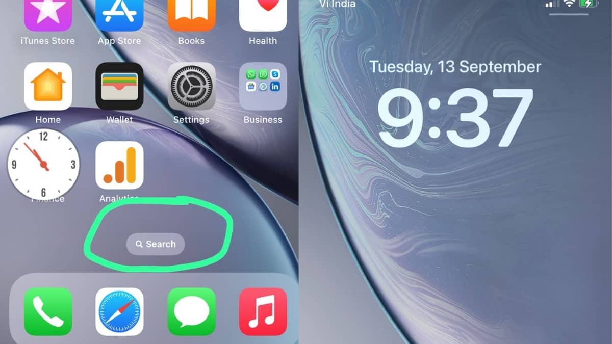
First of all, iOS 16 added a new search button. This came off as a nuisance to many users because of its placement at the bottom of the home screen, above the dock. Although the addition of a search button is meant to be handy in urgent requirements of searching something, its current placement makes one tap it accidentally creating disturbance in the workflow.
Secondly, the time appears to be larger now when the screen is locked. This does not come off as a positive feature to user experience or enhance it in anyway. Some users are complaining that this is just a distraction and feels forced.
Lastly, notifications appear at the bottom of the home screen. This reportedly is another discomfort and nuisance to users. This new layout lets several notifications and messages subside. Along with it, a user can see the previous message. Users are of the opinion that they would like to prefer the previous list layout.
The Fitness App, comes in with a new look. Although there has not been any major update to the app’s features the new look is being appreciated by the users. It is not all bad; there are many new features, which will enhance a user’s experience. In addition, yes there are ways to get rid of the features which users are finding annoying. The ios 16 upgrade is now available for download.


