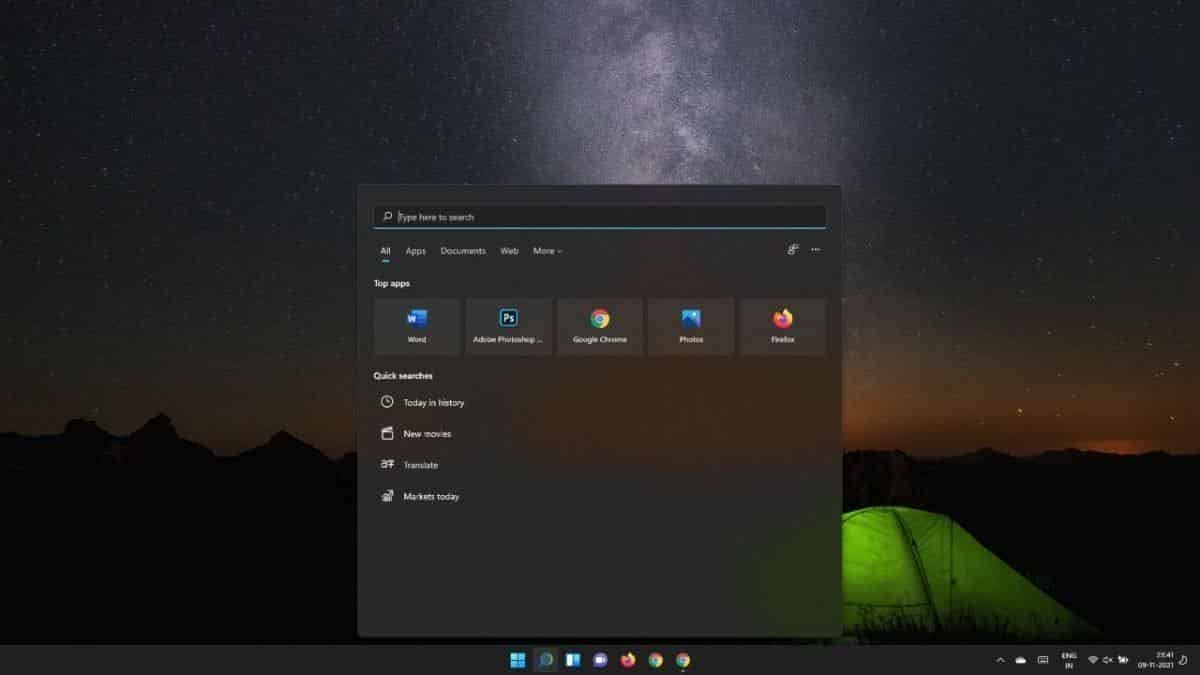
Microsoft trying become Apple? Windows 11 comes in with center align start menu / task bar, just like Mac

The new Windows 11 taskbar resembles the Mac’s Dock in appearance. There’s even a small dot next to the app icons to indicate that they’re running in the background. The program is operating in the foreground if you see an em dash instead of a dot. To put it another way, that’s the app you’re currently using.
The taskbar is positioned in the middle of the screen by default. If you want to restore the Windows 10 taskbar UI, you may easily shift it back to the left.
The new Start Menu is less cluttered than the old one.
Shortcuts to frequently used apps and objects can be found in the Start Menu. You can easily access all of the apps installed on your computer by clicking the All Apps icon.
This enhanced feature is very similar to the macOS LaunchPad.
By the way, if you think the Recommended apps and items are clogging up the Start Menu, you may remove them.
Rounded Corners on Apps
Because of the round window corners, the entire Windows 11 UI now seems considerably smoother. It’s also less cluttered, thanks to Microsoft’s removal of numerous unneeded components that were simply adding to the visual clutter. The animations are also smoother and more fluid.
New Window Designs
Better multitasking options in Windows 11 include the ability to instantly snap window configurations. You may instantly re-arrange the windows to better suit your needs after opening various apps.
Multitasking on the Mac has always seemed to me to be easier and more accessible than on Windows, so I’m delighted Microsoft has made these enhancements.
So, Did Microsoft Truly Steal macOS?
If you’re used to macOS, you’ll note that Windows 11 has a Mac-like appearance. Microsoft designed a minimalist, clutter-free user interface by removing numerous superfluous features. I’m confident that this decision was made based on the most recent ideas of effective user interface design, rather than an irrational desire to emulate macOS. The similarities between the two operating systems originate from the use of comparable design and functioning principles.
Apple has always been on the cutting edge of technology, and macOS has always appeared to be slick and modern. Many people jumped to conclusions since Microsoft overhauled the user interface for the first time in years. When you consider the never-ending Apple-Microsoft competition, it’s clear that this is only pouring fuel to the fire. Let’s not forget that Steve Jobs admitted in 2005 that Windows 95 was a carbon copy of the original Mac.
Take the new rounded window corners, for example. This design has been used by Android for a long time. Does this imply that Microsoft has plagiarised Android?
Overall, Windows 11 is the same Windows with a fresh coat of paint and new features.
The most important aspect is that, for the first time in years, the user interface feels current.
Conclusion
The user interface in Windows 11 is more user-friendly and clutter-free than ever before. It appears smooth and gorgeous for the first time in years. Some UI elements resemble those on macOS, owing to the fact that they are based on the same UI design principles. Microsoft has done a fantastic job of making the operating system more responsive. It’s also more user-friendly and intuitive.
What are your thoughts on Windows 11’s new design? Is it a thumbs-up or a thumbs-down situation? Do you believe Microsoft plagiarised macOS UI elements? Let us know what you think in the comments section below.


