Google is probably testing on how links will show up in Google search

On Sunday, my colleague Sushant discovered a new look on the Google News Tab. In which, the alignment of the news block from a particular publication was changed. This new look revealed the Publication name with the favicon was taken from the top to the bottom aligning with the date stamp. But soon after, it was changed back to where it was, like the Favicon, and the publication name was again stacked on the top.
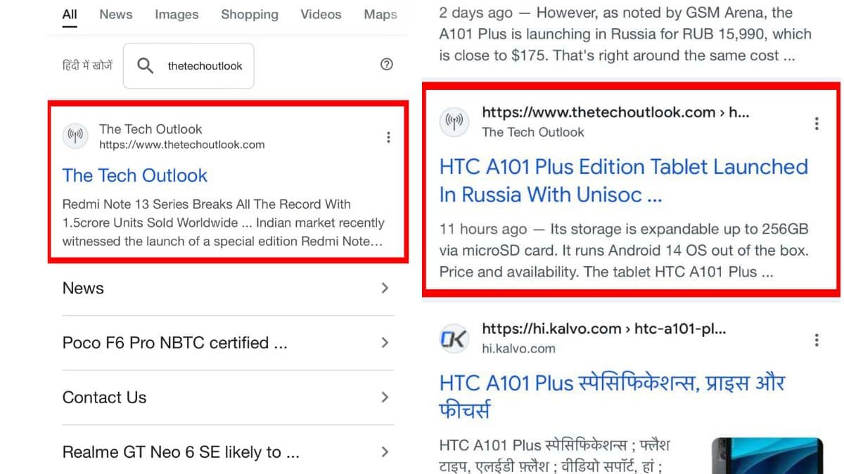
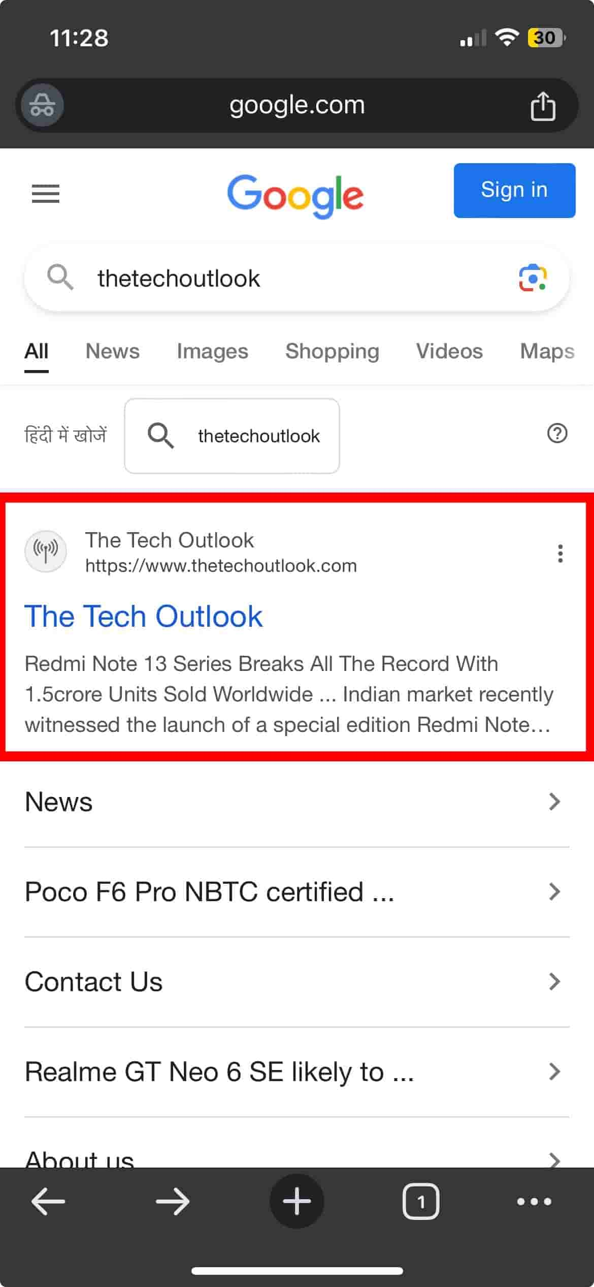
But today, while browsing, I discovered a slight change in the search results and quickly took a screenshot from my cell phone. The first screenshot that you see shows the regular appearance of the search, and the second image represents the change that I noticed. If you look closely, you’ll see that the URL has been moved just above the name of the publication, and you’ll also notice the favicon of the publication next to it. Unfortunately, I wasn’t quick enough to capture a screenshot from my laptop, so I can’t confirm whether both the mobile and desktop versions looked the same.
This would suggest that Google is likely preparing for an overhaul in the appearance of search results. Currently, there’s been no word from Google about whether they’re planning changes in how the search results will look. Hopefully, we’ll hear something from the Google team soon regarding this.


