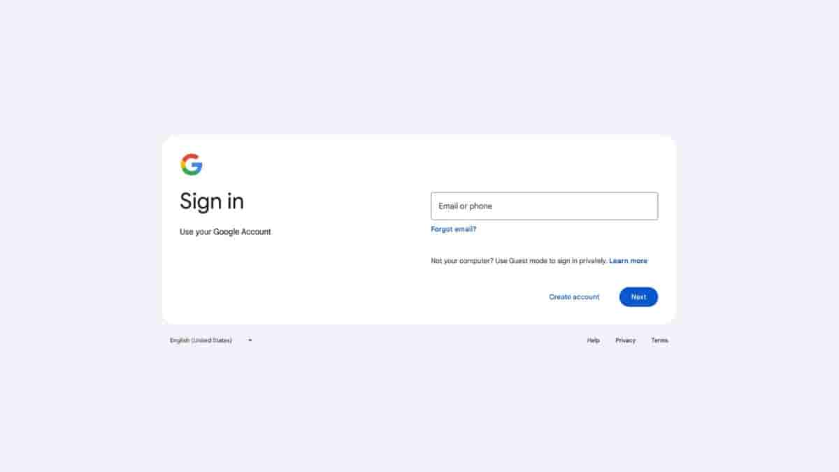
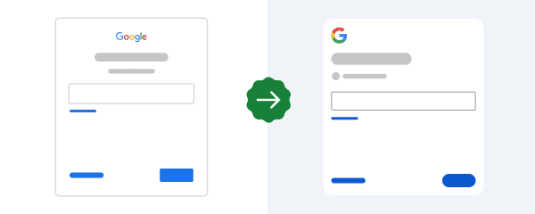
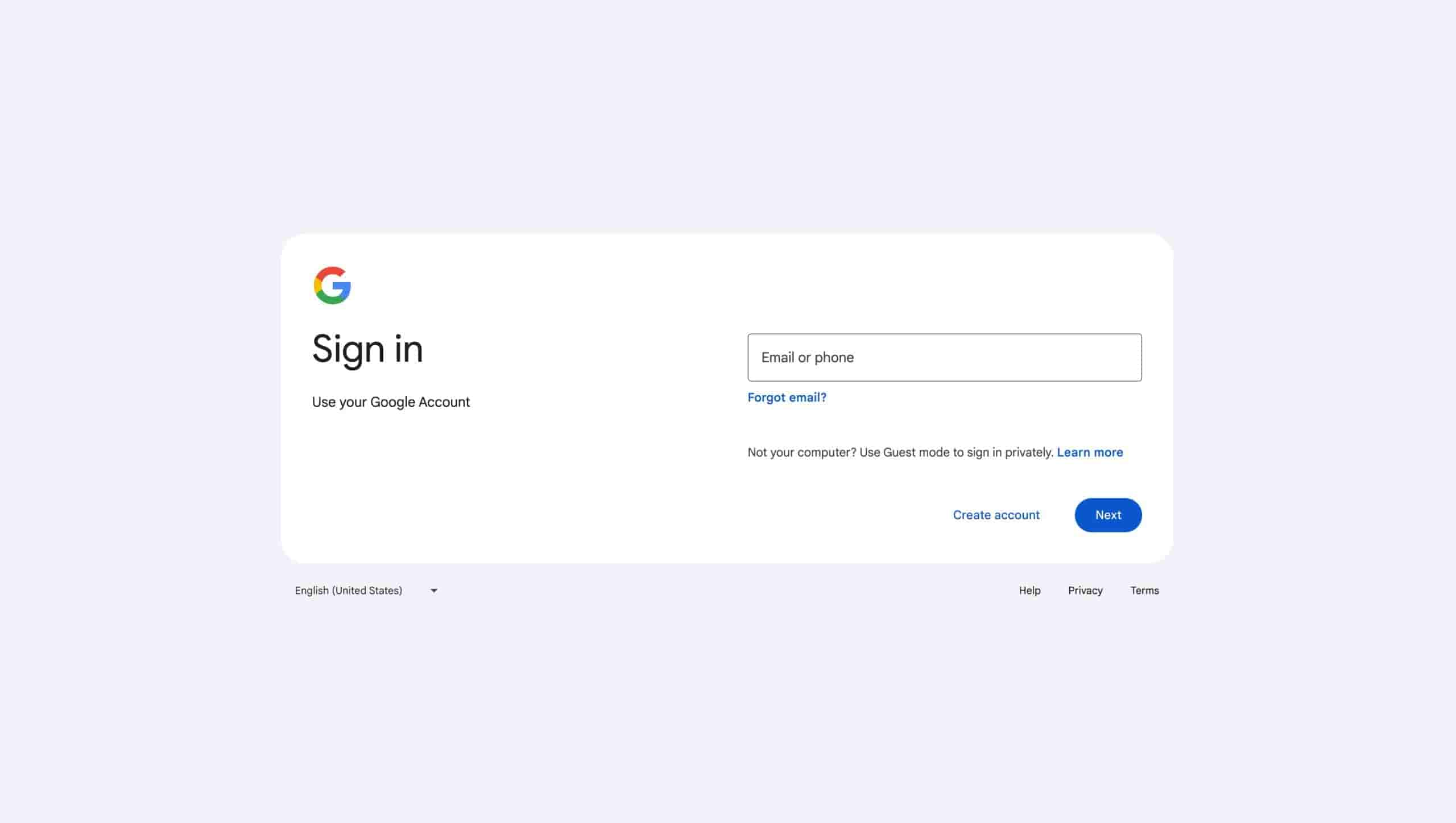
Google’s new Sign-in page arrives with a more modern and improved design; rollout has already started

A few days back when users were signing in to their Google account, they noticed a pop-up message that read “a new look is coming soon” which indicated that Google is working on improving the look of its sign-in page and very soon a new design will be rolled out. However, it was not confirmed when the new design will be introduced.
Well, Google has finally started rolling out the new design of its Sign-in page. Many users have already noticed the new design and it will be rolled out gradually to users across the globe in the next few days.


What’s the change in Google’s new Sign-in page?
This new sign-in page features a minimalistic design and the Google logo is also visible on the page while the design has a better layout for all screen types which includes large, small, and wide screens. Also, the sign-in page adjusts to the screen’s size enhancing the user experience. Apart from this the other things still remain the same like the field to enter your credentials.
The rollout will be available for all Google Workspace customers as well as users with personal Google accounts. Also to see this design, users need not make any changes in the settings as users will witness the new design automatically. It is said that it might take 15 days for this rollout to be completed fully.


