New Windows 11 Concept Design Revealed Online with Exciting Elements

A user(@thatjoshguy69) on the Twitter/X platform has shared a new design concept for the Windows 11 operating system of Microsoft and it is revealed to consist of some exciting new elements that can be adopted or implemented into the original.
Check it out below.
Windows 11 Concept Design Revealed
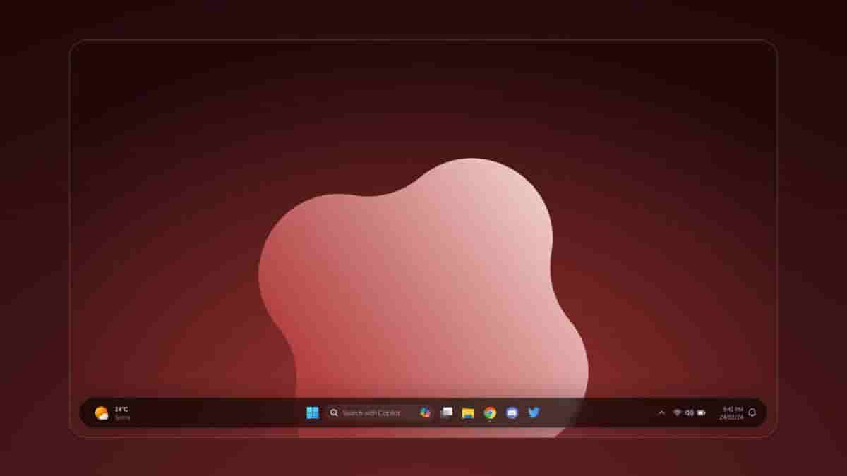
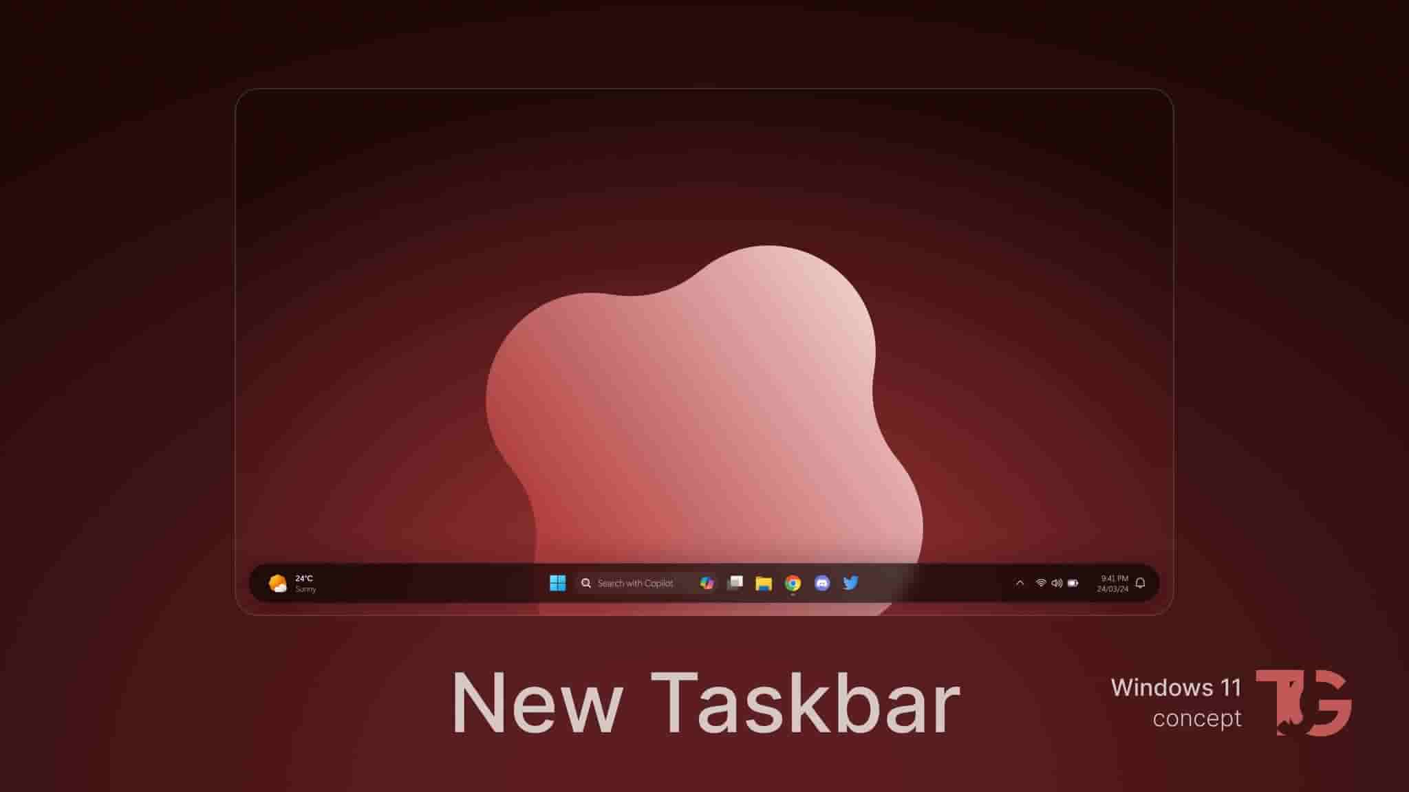
Firstly to note, unlike the usual Blue or Bluish colored wallpapers and themes that are often mostly found on Windows devices, the concept design has a Red/Maroon-like color for the wallpaper and the overall theme. Notably, the second thing that can be spotted is the unique taskbar that appears to float without being placed towards any sides. The design concept has it placed in a vertical manner and in total, the taskbar has a pill-shaped appearance.
The icons on the taskbar are similarly placed when compared to the Windows 11 operating system that is available on devices now with just slight differences. Some of the elements that can be seen on the design concept’s taskbar is the weather info on the extreme left, windows start icon, search bar, and other application icons on the center, and time & date, battery indicator, speaker icon, Wi-Fi icon, and more on the extreme right corner.

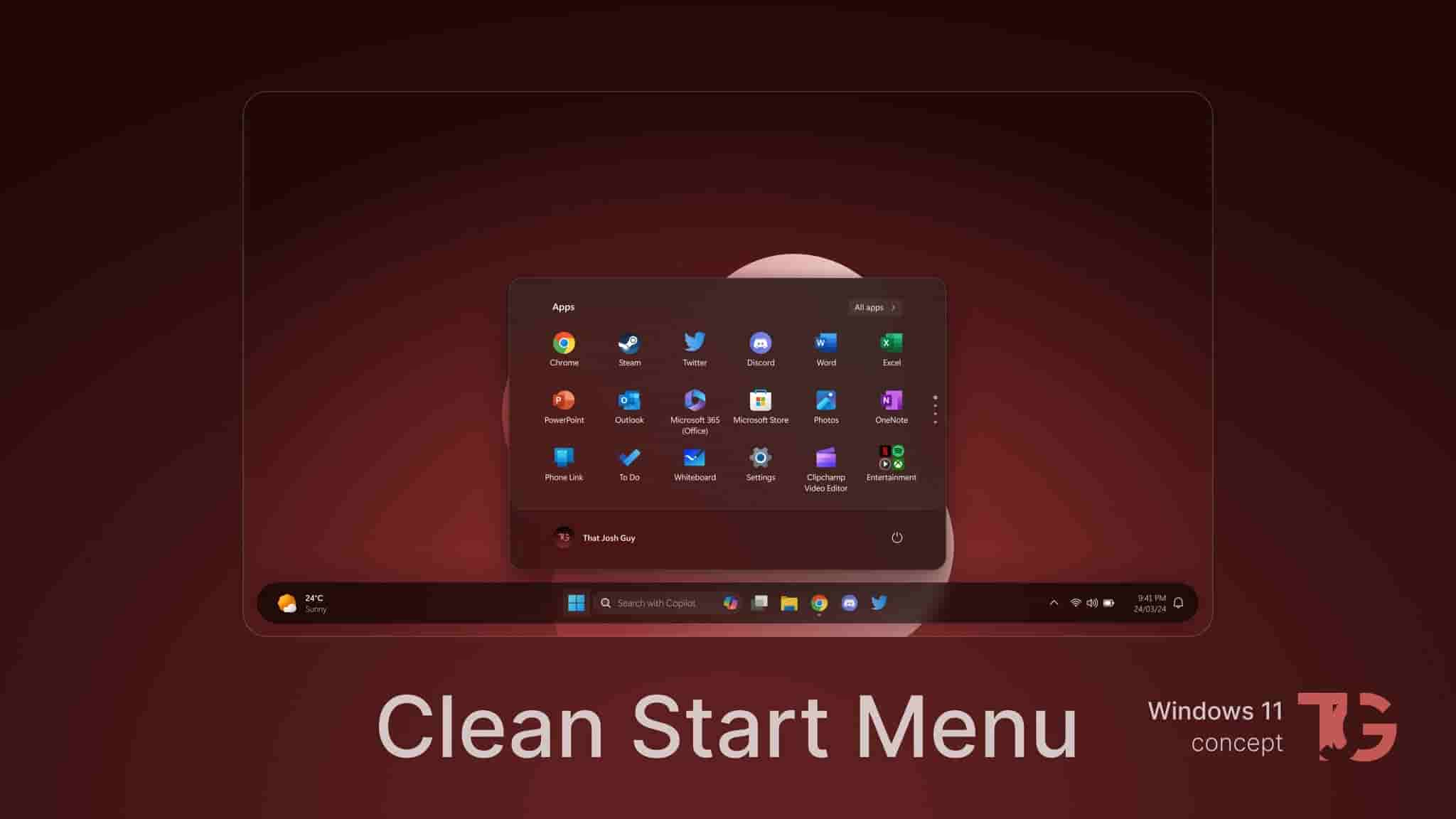
Speaking of the start menu, it has a clean look and is wider when compared to the original design. The background is opaque with only necessary apps placed with more below and that can be scrolled horizontally.

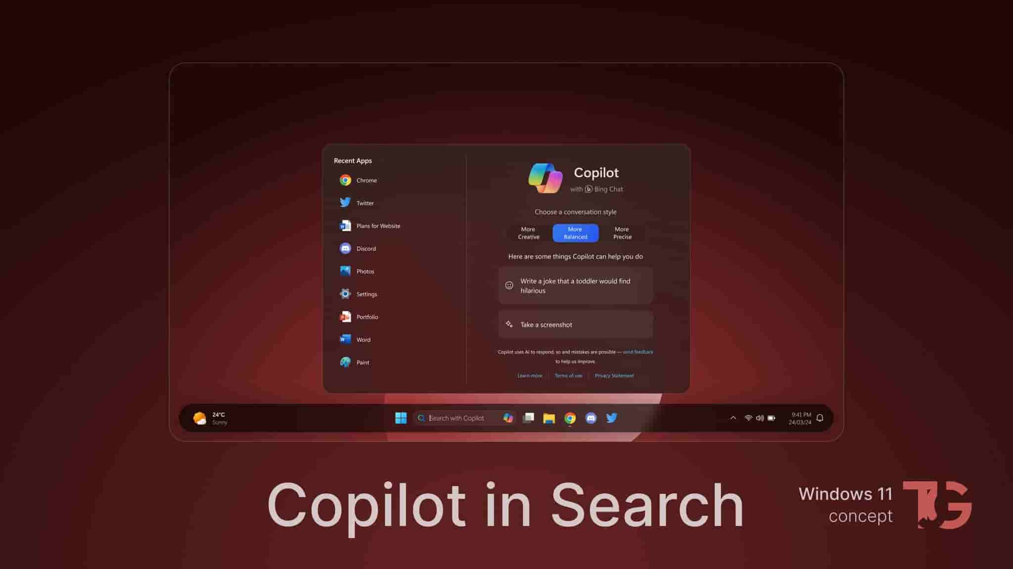
Another important change or an idea presented in the design concept is the integration of Copilot with Search rather than both being different entities. On the Search menu, recent apps as well as the Copilot interface can be found. Options to set or choose conversation styles (~ More Creative, More Balanced, and More Precise), add prompt, and to take screenshot have also been given.

Via.


