Nokia Wi-Fi App features new Nokia Pure UI ; What’s new for the users in this UI

On March 30, Nokia unveiled a new user interface called Pure UI, and as said by the company this new UI is a flexible, future-proof design system created for and by Nokia. With the Pure UI, the software icons and typefaces underwent a thoughtful redesign, emphasizing flexible strokes that can adjust to various hardware platform sizes.
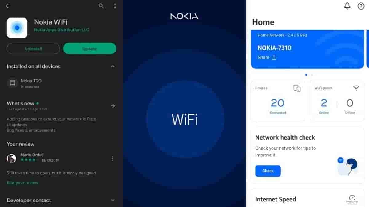
Nokia released the Pure UI but just after a few hours the new design style was removed from the website. The only way to get Nokia Pure on Nokia devices was to install a Nokia Wi-Fi app. The app has just been updated and as per the Play Store with this new update adding beacons has become faster, some bugs have been fixed, improvements have been made and a new UI has been applied.
What’s new for the users in this new UI?
Though reportedly, Nokia Pure Design UI was already used in the Wi-Fi app and the new change we are talking about was the welcome page which showcased a new Nokia logo and the name of the app in Nokia Pure letters.
The new Nokia Pure UI provides strong components that are suitable for creating intricate web-based dashboards. The UI also includes a dark mode, which automatically adjusts the styles of symbols and components. Apart from this, smooth animations are used, and fresh design language, minimalist design, and a distinct appearance are all included in the Pure UI.
If you are also among the users who use the Nokia Wi-Fi app then you can download this latest update from the Google Play store or Apple Play store in case you use iPhone or iPad.


