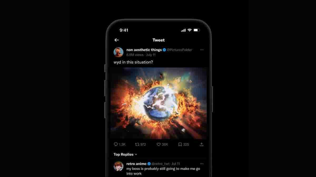
Twitter 2.0 new UI design revealed by Twitter designer, shows replies sort option

Ever since Musk has overtaken Twitter, it has undergone numerous changes. And now it’s about Twitter 2.0 which was announced by Twitter’s new boss Linda Yaccarino. In a series of tweets last month she explained “Twitter is on a mission to become the world’s most accurate real-time information source and a global town square for communication. That’s not an empty promise”.
Further, she wrote “The success of Twitter 2.0 is all of our responsibility.
We need to think big.
We need to transform.
We need to do it all together”.
We have the opportunity to reach across aisles, create new partnerships, celebrate new voices, and build something together that can change the world.
From what I can tell so far, we’re built for this.
— Linda Yaccarino (@lindayacc) June 12, 2023
NEWS: Twitter unveils new tweet details UI and it will let users sort comments! https://t.co/i3HD4FtMJZ
— T(w)itter Daily News (@TitterDaily) July 14, 2023
Twitter 2.0
Twitter 2.0 has begun taking shape reflected by the image shared by Andrea Conway. Andrea is a designer at Twitter and has shared an image on Twitter that shows the new tweet details UI. It shows how users will be able to manage replies that look quite similar to Reddit or Facebook. A drop-down menu can be seen that reads “Top Replies”.
The mock-up shown in the image does not have “views” but shows bookmarks. As it’s a mockup, changes are likely to be made before it goes public. The post dimension has also been changed in the mock-up which looks quite impressive.
Twitter has recently made some harsh changes like rate limits for users which users are not in favour of. And recently it shared the requirements for the ad revenue share program that was quite high for the small creators. It’s been going through major changes despite growing competition in the market, but it would be interesting how users respond to Twitter 2.0.


