You May Get To See News In This Way On Google In Coming Days

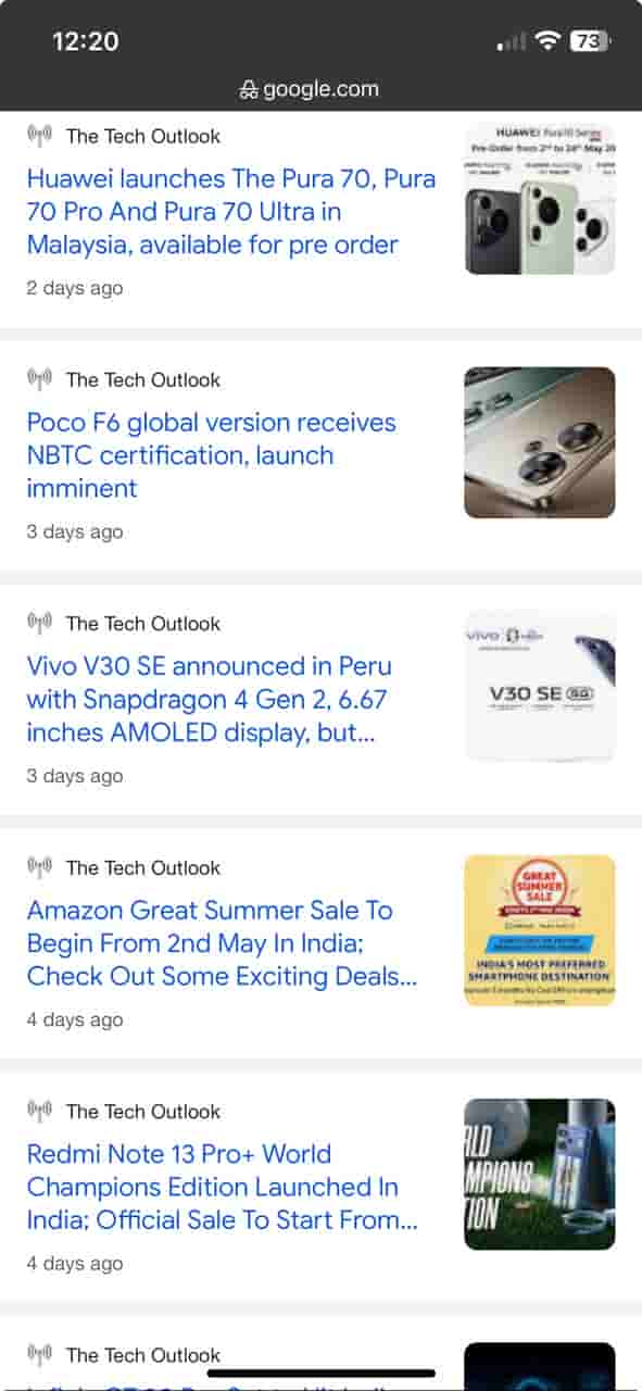
Google is probably testing a new way to show the news in the news tab. This morning when I was scrolling down through the news tab on my smartphone I spotted something unusual. Usually, when we tap in the News section of Google to read news, we find several news headlines related to a particular event stacked one over another with the publication name, its favicon, and the date when it was published. There is an arrangement that we see in which the favicon and publication name appear at the top and then comes the headline with the hyperlink and below it we see the day or time when it was published.

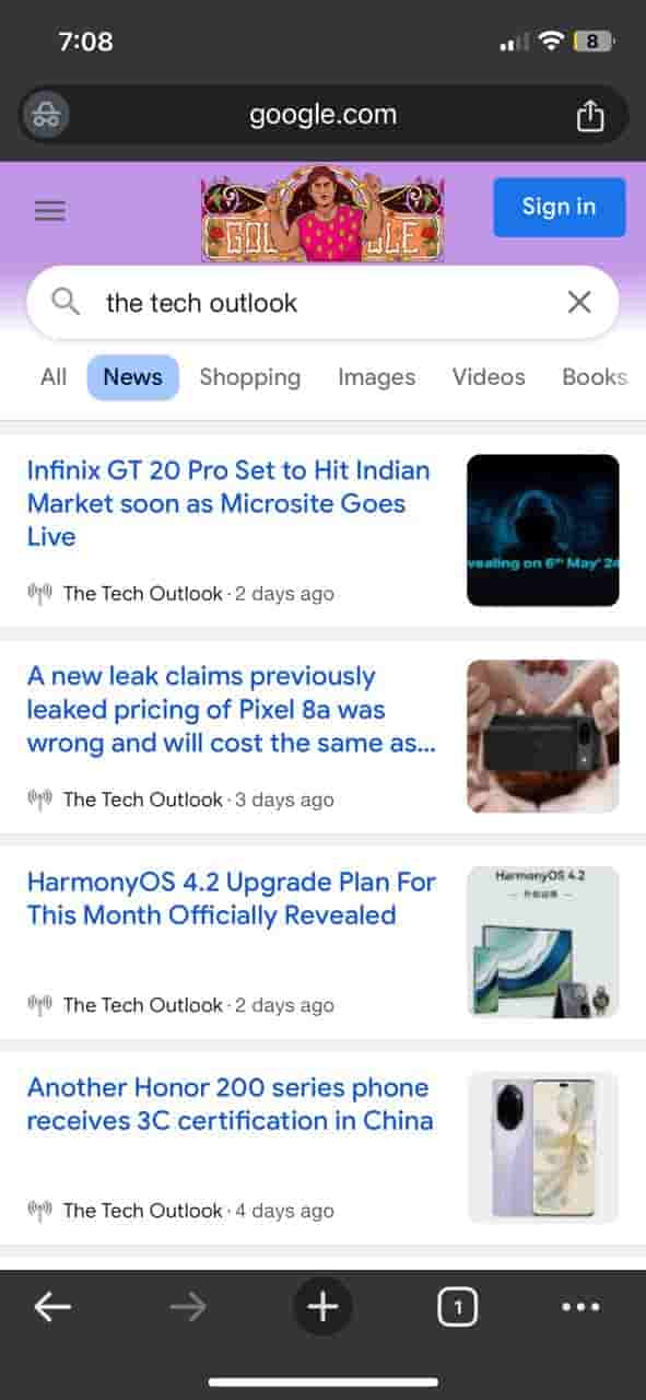
I found everything was there but with a different arrangement because the logo and favicon moved below the headline alongside the time when it was published. And is worth mentioning here that this arrangement looked more symmetrical and clean than before.

This lets you see the hyperlink attached headline as soon as you go to the News tab. This changed pattern did not appear to me when I tried to open it for a second time. Google might be testing this or may change it for all very soon. For such interesting spotting and updates stay tuned with the Techoutlook.


