Here’s how to make your Gmail Inbox layout suit your workflow and taste

For many people, the default Gmail layout is adequate. Why bother changing something that works? Others, on the other hand, believe that there is always a better way to do things – or, at the very least, a way that better matches their requirements. And, while the default Gmail layout is pleasing to the eye, it may not be the most effective way of communicating.
Gmail, for example, normally displays five tabs by default: Primary, Promotions, Social, Updates, and Forums. How do you make this more favorable to your sense of efficiency? Allow me to demonstrate.
Gmail has a few customization options, including:
- Layout: The amount of information presented in the left pane.
The global theme is applied to the UI. - Inbox Type: The actual UI layout.
- Reading Pane: The manner in which the Reading Pane is shown.
- Email Threading: Controls whether or not emails appear in the conversation view.
- We’ll concentrate on the Inbox Type option because it has the greatest impact on how Gmail appears to you.
Here is how you can change your Gmail layout
1. Log in to Gmail
The first step is to open a web browser and log in to your Gmail account.
2. Open the Settings pane
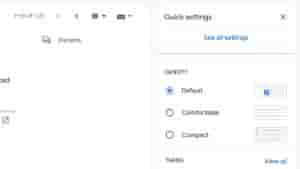
Then, in the upper right corner of the window, click the Gear icon to access the Gmail Settings pane. This will reveal the relevant layout parameters (no need to click). The image below shows All Settings.

3. Customize the Default layout
Click Customize beneath Default to see the settings window for the Default layout.

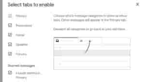
You can enable/disable the various tabs in the resulting window. The Primary tab is the only one that cannot be disabled. Disable that tab, for example, if you don’t want to get emails from forums.
Any tab you disable will send an email to the Primary that would typically be grouped with that tab. In the Primary tab, you can also enable and disable starred messages. The Customization Options provided by each Inbox Type differ.


