Google is probably testing a new way on how search links will appear, check details inside

We have been following Google’s efforts to improve search, and earlier we reported on how Google was experimenting with the appearance of search results in the mobile version. This time, however, we have spotted changes on the desktop version.
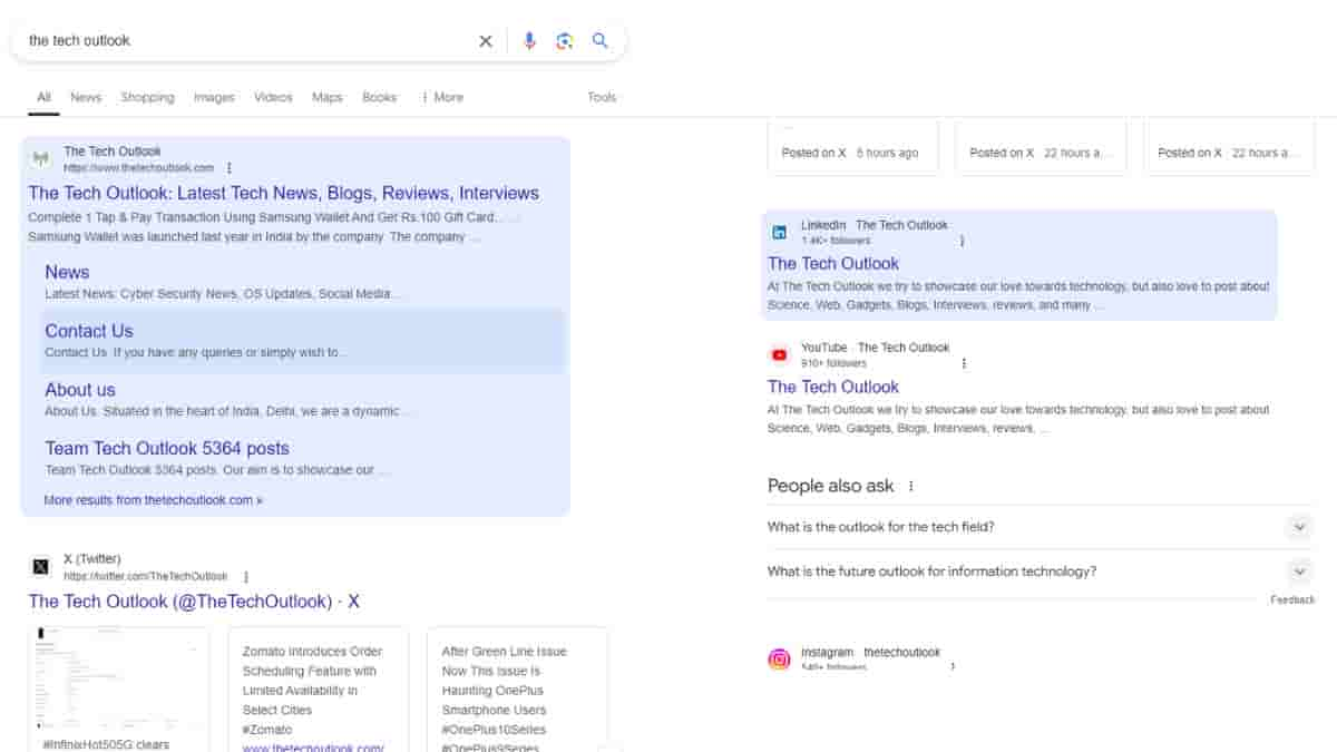
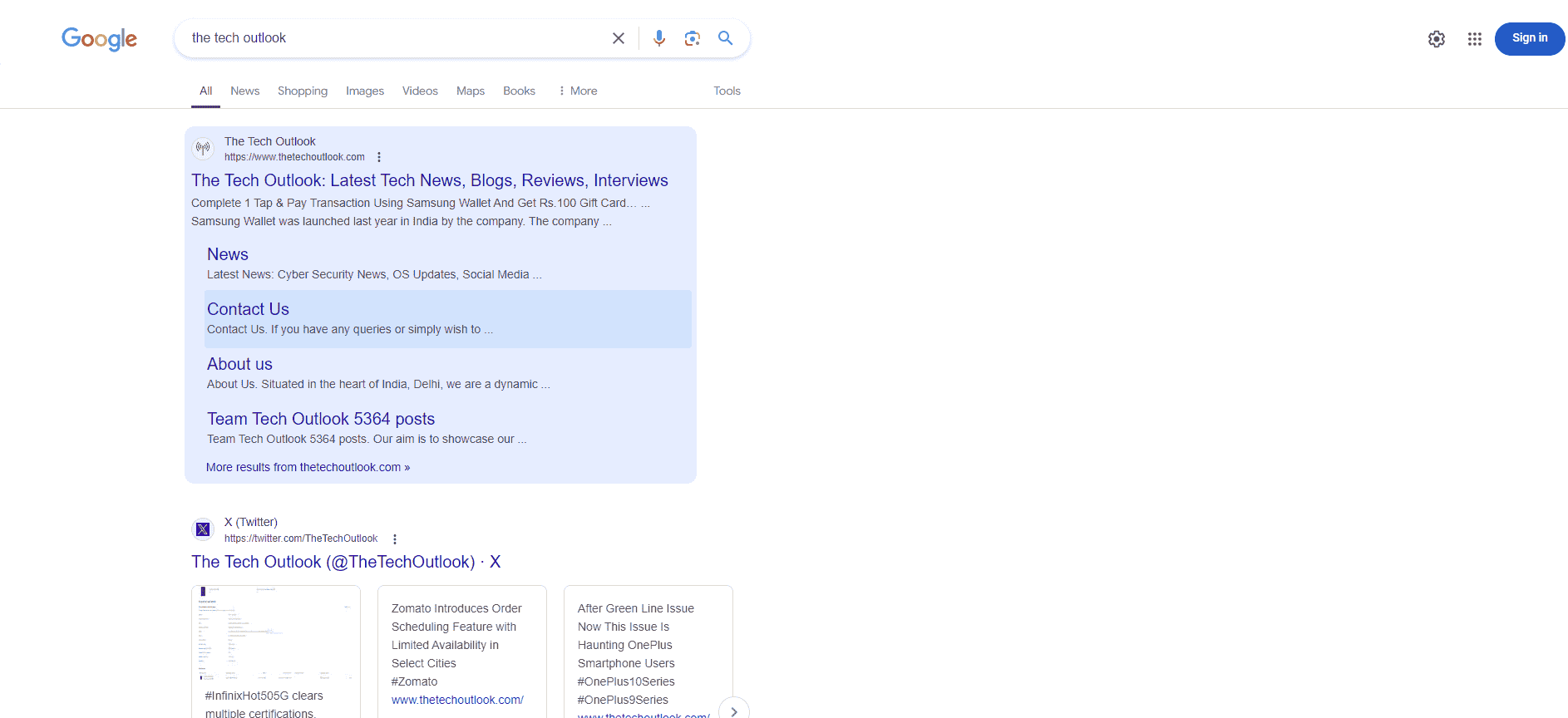
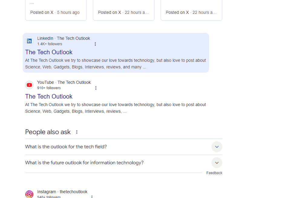
In this new discovery, when we typed in our search query and the results were displayed as usual, we noticed something interesting. When the mouse hovered over the links, the whole text was highlighted. While this might seem odd to some, I feel that it could help prevent misguided clicks that sometimes occur.
The entire area of the link, including the metadata and other details, is now surrounded by a blue colour overlaying it. With all these changes in the works, it will be interesting to see what Google actually implements in the coming days.


